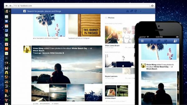
 Facebook hasn’t forced us to look at a design change in over 2 years, I remember when I avoided updating to the “NEW” facebook redesign and then complaining about it at coffee shops. (Damn I used to be a hipster.) The news feed is how we exchange info, between statuses, our like pages (Like FAUX SOCIETY if you haven’t btw) photos, links and other stuff that wastes our time. The new design has supposedly taken inspiration from “newspapers” and will section all various divisions that the personalized website has to offer. Take photo albums for instance—”they’ll be bigger, with more thumbnails giving you an easier at-a-glance sense of what your friends actually did, and where.”
Facebook is splitting up the feed into subcategories—Music, Photos, Games, Friends—so that you’re not overwhelmed and bombarded with so much information at once. It’s a subtle way to organize a rather cluttered site, that sees great stuff get lost through the cracks and monotony of the refresh button. Check for the changes to take place on your facebook page, over the next couple of days.


